A website that finally sounds like her
Prime Assist VA had never had a website before. The brief wasn't really about pages or features — it was about making sure the site actually sounded like Chantelle: her tone, her colours, her own way of putting things.
A first website, built to sound like her
Prime Assist VA is Chantelle Breslin's virtual assistant business — inbox and diary management, bookkeeping, invoicing, data entry, and document support for small businesses too stretched to do it all themselves. Before this project, the business had never had a proper website of its own.
The brief was simple on paper: get something live. What mattered more was capturing exactly how Chantelle wanted to come across — warm, capable, editorial rather than corporate — using her own tone, colour preferences, and ideas, rather than a template with her logo dropped in.
Where this started
- AskFirst-ever business website
- PriorityHer tone, colours, ideas
- PlatformWix — client's own account
- PagesOne-page + booking form
- PaletteForest, Honey Gold, Sage, Cream
- FontsFraunces + Plus Jakarta Sans
- HostingWix + Google Workspace
- RevisionsRefined until it matched exactly
Three passes. Closer to her voice each time.
There wasn't a long back-and-forth over structure — the scope was smaller than a multi-page technical build. The real work was making sure the finished site actually sounded like Chantelle, not like a template wearing her name.
Listening before designing
Before any layout work started, the brief was built around Chantelle's own tone, colour preferences, and ideas — not a stock template repurposed with her logo on it.
A first draft that was already close
The first working version reflected that brief directly. It landed close enough to what Chantelle had pictured that the next round was about refinement, not a rethink.
Tweaks until it matched exactly
A short round of adjustments — copy, spacing, small colour and layout tweaks — took the site from close to, in Chantelle's own words, exactly as imagined.
Six services, laid out the way she actually delivers them
Prime Assist covers a wide spread of admin, marketing, and finance support. The site needed to make all six legible at a glance, not buried in paragraphs of prose.
A site that reads like an introduction, not a brochure
One scrolling page — hero, six services, a proper about section built around twelve years of corporate experience, a three-step how-it-works, and a contact form that notifies Chantelle the moment someone gets in touch.
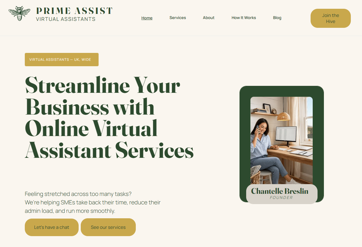
primeassistva.co.uk — homepage
We start with how someone actually sounds
Not every brief needs five pages of technical detail. Some need the opposite — enough restraint to let someone's own voice come through instead of a template's.
Colour, tone, and ideas were gathered before a single section was designed, so the first draft wasn't a guess.
A working first draft, close enough to the brief that Chantelle could react to something real rather than a mood board.
Small, specific tweaks rather than a second full pass — because the first one was close enough to just need finishing.
Prime Assist VA's site was an early Builtly project, and one Chantelle trusted with her business's first ever website. Getting someone's voice right on a page is a different kind of hard to getting technical detail right — and just as easy to get wrong. We're glad it landed exactly the way she'd pictured it.
I approached Zara to help with my website as I had never built one before. She listened to my tone, color scheme, and ideas, and the first draft she built was very close to what I had in mind, with a few tweaks, we had it exactly as imagined. Zara was very professional and communications were always clear. I really enjoyed this project and our meetings regarding the website updates. I would highly recommend Builtly to anyone looking for a website.